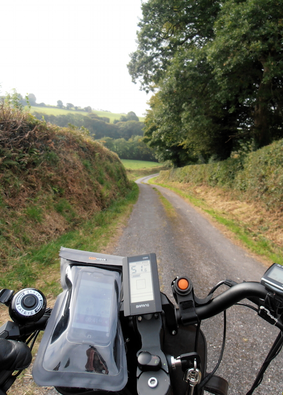
I'd start by checking the legibility of the iPhone and the App, separately and together, before I did anything else. I'll explain each.
I keep my heart rate monitor, by which I regulate my output on the bike, linked from the Polar H7 monitor belt by Bluetooth to my iPhone on the handlebars. The iPhone screen al fresco is a very variable experience. Under trees or cover it is decently legible but in sunshine or even overcast dull, even, overhead light, it is perfectly illegible. And though my iPad lived from day one in a great big heavy Griffin Defender case in expectation of taking it outside and making original art on it, I tried it only once, couldn't see anything on the screen, and never took it out on my bike again. (For routing on my bike we use Ordinance Survey maps, a few bucks, a much more legible scale and more complete than electronic maps, and they last years if you keep them in a plastic sheath and take care to fold them sensibly.)
So my first question to you would be, before you even consider the app, is: Do you have satisfactory experience of using your iPhone as a screen on the handlebars of your bike? I don't know anyone who has. I suppose to some extent it depends on where you ride: in the Mojave the iPhone would be impossible, in Sherwood Forest you wouldn't notice the screen's shortcomings or at least not so much.
It is also worth looking up the screens of the App at the Appstore. Polar's App used to have an interface that worked decently quite a bit more often than now, though it was graphically a dull design. Then they updated it to something called Polar Beat, and let some idiot designer who fancies he operates at the "cutting edge"* loose on it, and he remade it in reds and other colors that don't show well in sunlight, and aggravated the iPhone's shortcomings further by a very odd choice of what to emphasize and what to make small. Clearly
not a bicycle-centric design made by a cyclist for cyclists -- miles from it.
*Beatrice Webb put the purpose of graphic design well over a century ago when she said that the designer's personality must be as unobtrusive as the crystal in which the best wine is served, so that one notices only the wine. If a designer tells you he's "on the cutting edge", run a mile; he's a grandstander for his own ego and never mind your product or the legibility of the information customer wants.
The best dials on my bike are the old-fashioned bike speedo/computer and the similar controller readout for the electronic gibbons, both made of those crude bar/save thingies which light up in combinations, black or dark brown against a green background. The iPhone, which costs many times as much as both together, simply cannot compete.
Here's the difference between the two types of screen in good light -- i.e. bright sunlight or bad light for any kind of electronic screen -- and that's the good old version of the Polar App, not the bad new one! You can easily see that the green screens leave the iPhone for dead. In practice both the green screens are readable at a glance even in bright sunlight, and the iPhone can be puzzled out only in relaxed riding circumstances on very dull, overcast days or in the shade of trees or buildings.

I have no great experience of the Garmin; I tried one, dismissed it as, "Intended for the inside of a closed car, not the handlebar of a bike," and didn't bother again because I considered they have the wrong attitude. Also, I thought their prices ridiculous, especially for their starter wristwatches. I could buy five or more full Chinese "smart" wristwatches, like a minicomputer with full GPS on your arm, for the price of one underspecified Garmin article. I've never considered it proper for a manufacturer to attempt to use me as an unpaid beta tester for an unready product, and that is exactly what all the Garmins I've ever eyed are, too little, too late, too behindhand.